ACOP.NET API
AcopButton

AcopButton

AcopButton1.jpg

Acop Button Example

Use the ACOP button to send specific commands

... to either the underlying LinkAddress and LinkProperty transport end point or to another component in your application.

The button can also be configured as a toggle button, in which case the command settings sent alternate between two different values, a primary value and a secondary value. The button fore color can indicate whether the target end address current has the desired setting (is in sync) or not.

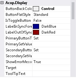
AcopButtonDisplayProperties.jpg

Acop Button Properties

ButtonBackColor specifies the background color of the button (default = control grey)
ButtonFlatStyle specifies the button display style (default = Standard)

  • Flat
  • Popup
  • Standard
  • System

IsToggleButton if true designates the ACOP button as a toggle button which alternates between the two input value/text specifications.
LabelInSyncForeColor specifies the button label forecolor when the button setting is the same as (in sync with) the current readback setting value (if the button is attached to an attribute LinkProperty). (default = dark blue).
LabelOutOfSyncForeColor specifies the button label forecolor when the button setting different from (out of sync with) the current readback setting value (if the button is attached to an attribute LinkProperty). (default = dark red).
PrimaryButtonText specifies the primary (start up) button caption text. If the button is not a toggle button (IsToggleButton = false) then this remains the button caption.
PrimarySetValue specifies the value to send to the underlying LinkAddress and LinkProperty as a setting command.
SecondaryButtonText specifies the secondary (toggled) button caption text (applicable only if the button is a toggle button). The button caption text will alternate between the primary and the secondary button texts following each button click.
SecondarySetValue specifies the value to send to the underlying LinkAddress and LinkProperty as a setting command when the button has been toggled to the secondary setting. The button set value will alternate between the primary and the secondary button set values following each button click.
ShowErrorMessages if true instructs the button to show a modal popup message box with a status error message if the button set command was not successful.
Target if not empty, should be in the form of 'ControlName.Property'. The setting will set the given control property to the button set value"). This will also supercede and LinkAddress and LinkProperty which might be attached to the button. <img src="TargetControlEditor.jpg" alt="TargetControlEditor.jpg">
ToolTipText gives an user supplied tool tip text.


Datenschutzerklaerung   -   Data Privacy Policy
Generated for ACOP.NET API by  doxygen 1.5.8