|
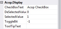
Acop CheckBox display Properties
| CheckBoxText specifies the text to display next to the check box.
DeSelectedValue specifies the value setting when the check box is in the unchecked state.
SelectedValue specifies the value setting when the check box is in the checked state.
ToggleBit can be used to specify that the selected and deselected values apply to a specific bit in the setting. '-1' (default) implies that no bit is selected. If a bit is selected, then the DeSelectedValue and SelectedValue are ignored.
ToolTipText is the preferred tool tip text. If left blank then the underlying LinkAddress and LinkProperty are used.
|


 1.5.8
1.5.8