|
Acop Label Example
| Use the ACOP Label for displaying values.
You can display data values from the underlying LinkAddress and LinkProperty assignment(s) to the control.
This will be a simple string format preceded by the value description, which, unless ShowDescription = false, will be discovered from the LinkProperty unless specified via the Description property.
The ACOP Label is capable of displaying the elements of a multi-channel array or structure as well as a single value.
It can also display values with different background and foreground colors depending on any assigned warning thresholds.
|
|
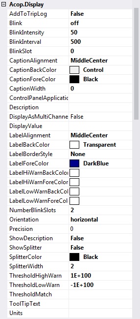
Acop Label display Properties
| Blink set the blink mode for the value label
- off (default)
- onWarning
- always
BlinkIntensity set the blink intensity for the label value label (up to 100% lighter or -100% darker) (default = 50)
BlinkInterval set the blink interval (msec) for the value label (default = 500)
BlinkSlot set the blink slot for the value label (0 up to NumberBlinkSlots) (default = 0)
CaptionAlignment specifies the aligment for the description caption text.
CaptionBackColor specifies the backcolor for the description caption.
CaptionForeColor specifies the forecolor for the description caption text.
CaptionWidth if non-zero, provides the desired caption width (if ShowDescription = true else the width of the width of the description text is used.
Description if non-empty then the string provided will be used as the caption text (else the LinkProperty's description.
DisplayAsMultiChannel if true: display each channel value in the target array values as a multi-line string in the label caption.
DisplayValue if non-empty then the displayed value upon successful update will be the value given.
LabelAlignment specifies the aligment for the value label text.
LabelBackColor specifies the backcolor for the value label.
LabelBorderStyle specifies the border style for the value label.
LabelForeColor specifies the forecolor color for the value label text.
LabelHiWarnBackColor BackColor to use if number value is greater than ThresholdHiWarn or if string value does not equal ThresholdMatch
LabelHiWarnForeColor ForeColor to use if number value is greater than ThresholdHiWarn or if string value does not equal ThresholdMatch
LabelLowWarnBackColor BackColor to use if number value is less than ThresholdLowWarn or if string value equals ThresholdMatch
LabelLowWarnForeColor ForeColor to use if number value is less than ThresholdLowWarn or if string value equals ThresholdMatch
NumberBlinkSlots set the number of blink slots for the table cells (at least 2) (default = 2)
Orientation the label orientation (non-horizontal will turn off the description label)
- horizontal (default)
- vertical_up
- vertical_down
Precision precision to use for floating point numbers (0 = general display)
ShowDescription if true (default) displays the description prior to the value label.
ShowSplitter if true displays a splitter line between the description caption and the value label (default = false).
SplitterColor specifies the color for the splitter when it is visible.
SplitterWidth specifies the pen width to use for the splitter when it is visible.
ThresholdHighWarn if the link data is numerical, then the threshold provided is used for comparisons with the monitored data
ThresholdLowWarn if the link data is numerical, then the threshold provided is used for comparisons with the monitored data
ThresholdMatch if non-empty and the link data is non-numerical, then the string provided is used for comparisons with the monitored data
ToolTipText specifies the preferred tooltip text for table. If un-specified, then the address parameters will used.
Units the value units (applied to the component's description)
|


 1.5.8
1.5.8