ACOP.NET API
AcopSlider
AcopSlider1.jpg

Acop Slider Example

Use the ACOP Slider for smoothly applying set-point changes between maximum and minumum values.

You can first establish the new set point and then apply the value or apply continuously. The set-point is typically assigned to the underlying LinkAddress and LinkProperty but can also be assigned to a property attribute of another component withint the application (e.g. the axis settings of an ACOP Chart).

If the assigned ACOP Link is an attribute then the readback value is displayed as well as an application defined reference value. If the set-point value shown in the Slider is in sync with the readback value then its Slider value is displayed with the same color as readback (default = DarkBlue) else it is displayed in an out-of-sync color (default = DarkRed).

An access lock can easily be obtained via a checkbox (if supported by the transport protocol).

A return to the assigned reference value is offered by the reset button.

AcopSliderDisplayProperties.jpg

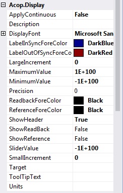
Acop Slider display Properties

ApplyContinuous if true then any change in the slider position applies a new set value. This is nominally equivalent to setting the cont. checkbox to a checked state at design time.
Description if non-empty then the string provided will be used as the caption text (else the LinkProperty's description.
DisplayFont font to use intialize the acop control
LabelInSyncForeColor ForeColor to use if setting is synchronized with the current readback value
LabelOutOfSyncForeColor ForeColor to use if setting is not synchronized with the current readback value
LargeIncrement the large increment setting value (applied when the double arrow button is clicked).
MaximumValue the maximum setting value
MinimumValue the minimum setting value
Precision precision to use for floating point numbers (0 = general display)
ReadbackForeColor default ForeColor to use for the Readback label
ReferenceForeColor default ForeColor to use for the Reference label
ShowHeader if true (default) displays the slider header information as well as the set, ref and reset buttons.
ShowReadback if true show the readback needle in the slider (default = false)
ShowReference if true show the reference needle in the slider (default = false)
SliderValue value at position of slider
SmallIncrement the small increment setting value (applied when the single arrow button is clicked).
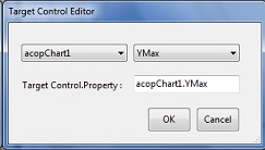
Target if not empty, attach the target control property to the slider value

TargetControlEditor.jpg


ToolTipText specifies the preferred tooltip text for table. If un-specified, then the address parameters will used.
Units the value units (applied to the component's description)


Datenschutzerklaerung   -   Data Privacy Policy
Generated for ACOP.NET API by  doxygen 1.5.8